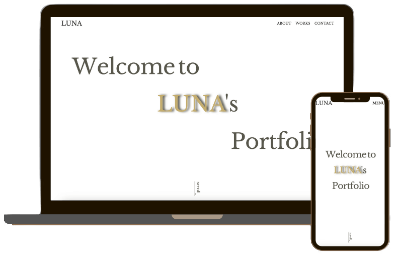
my portfolio
- Type: website
- Launch date: 2023/10/30
- URL: https://lunazuchi-portfolio.site

- Target
-
Customers (both individuals and companies), web design agency with whom I work.
- Purpose
-
To showcase my achievements, skills and my character in order to be entrusted with a job.
- Points
-
-
1. Layout
The site was designed with 'simplicity' in mind, so that you can refer easily to the content of my works, achievements and skills. I believe that trust is the most important aspect of our work, so I have placed a self-introduction section at the beginning of my site. Also I added movement throughout my site to avoid boredom.
-
2. Color scheme
The colors of the Spanish flag, red and yellow, were consciously used. For user readability, the basic text color is black. Yellow is used for headings, links and emphasis areas
-
3. Font
European: Libre Baskerville
Japanese: ZEN Old Mincho
Serif fonts were used to give a sense of trust and express a honest character. As the proportion of European text is small, a balance was achieved by using a thicker font compared to the Japanese text. For the Japanese text, a fine line Mincho font was used to enhance readability. To give a sense of gravitas leading to a sense of trust, ZEN Old Mincho, which has an old-fashioned impression, was used. -
4. Production scope and duration
Design: 4 days Development: 3 days
-